Well here it is guys! I’m so excited! This new design has been in the works since June, and it’s finally here just in time for my 3 year blog anniversary! Can you believe it’s been 3 years?
I was going to make a cake for my blogiversary but decided cakes are not even cool.
False. Lies. I made one and it was kinda melty and subpar, so it’s sitting on my counter, absolutely pouting, and I am blowing out pretend candles.
Gotta keep up that Food Charlatan name, right?
So let me walk you through some of the Exciting New Things about my blog design. The graphic design was done by my lovely sister-in-law Reesy, and Julie of Deluxe Designs implemented the web design. I’m so happy with the way it looks!
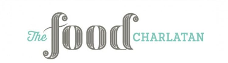
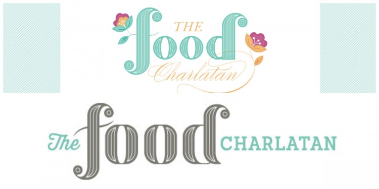
The new design is a lot cleaner and easier to read. I feel like it’s a lot more “me.” Not too fussy, and not too girly-swirly, but still reminiscent of my old design. The “Charlatan” part used to be a little hard to read, and since a lot of people don’t even know what charlatan means, I felt like something simpler was needed.
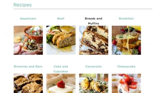
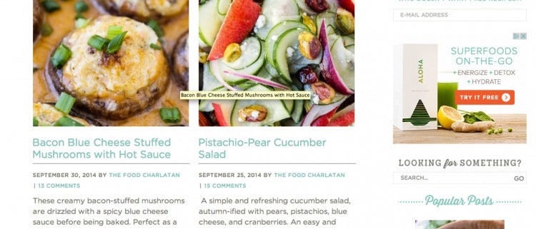
The next best part, especially for you guys, is the RECIPE INDEX, that is no longer a black hole of links. It is a visual index, so you get pretty pictures of each post. That way you know what you are getting before you even click. I have it categorized by recipe type, like Main Dish, Dessert, Cookies, Beef, etc. I’m still working on categorizing all the recipes that I’ve posted over the last 3 years, so bear with me as I get it all finished. (Shout out to Eric who is Categorization King.)
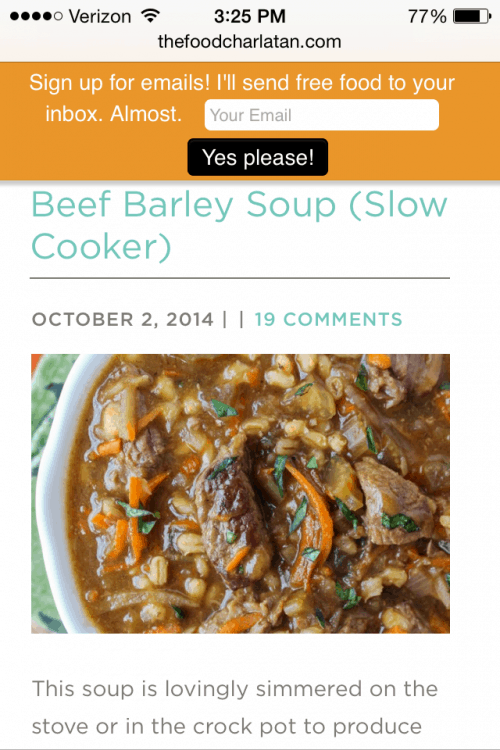
About 60% of you are on a device that is not a desktop computer, and a full 30% are on a phone. You used to have to zoom in to even read the text, which I know is annoying. It should be a lot easier to read now. I know it’s not perfect yet, but more changes are coming, I promise! It will get even better.
The homepage has changed up a bit too. Instead of just launching into my latest post, you get one big teaser post at the top with lots of these little teasers at the bottom. Before I had 3 full posts load as the homepage, which was quite a bit. My posts have gotten more lengthy this year as I’ve been adding how-to shots, etc, so 3 posts was a lot to load. Teasers will help my homepage load faster, and allow you to get around to any of my most recent posts a lot easier.
So what do you guys think? Do you like it? Is this the same as asking you if this dress makes me look fat? WELL DOES IT?? :)
Thanks for reading guys! I’ll be back on Wednesday with a fun Halloween treat. Yes, Halloween! It’s October people!! Boom.


It looks very nice!
I. LOVE. IT! These colors are my favorite – the fonts are amazing. And I wish I had a slice of that totally average cake. ;) Lies – it’s probably so amazing that you want to keep it all to yourself. Save me a slice when I see you? Kthnx.
The update looks great! And the new recipe index is AWESOME! :)
Looks great Karen! I love the clean but colorful look you have going on! Makes your beautiful photography completely stand out!
This blog design definitely doesn’t make you look fat. :-)
If I were any more excited about the updated recipe index…and how I don’t have to maximize the blog on my phone anymore…I wouldn’t know what to do with myself. So classy and simple! I love simple.
I love it Karen! Congrats on 3 wonderful years!
I love it Karen! So pretty!
Karen, it looks great! Seems really nice and navigable. One day I’ll update my design (sigh). For now, I’ll just keep pretending I know a thing or two about CSS – haha! Happy Blogiversary/Blogversary/Blog Anniversary (whatever you call it)!
Absolutely GORGEOUS Karen!! It’s totally you — girly, cute, and still chic. Love it!! So happy for you, and I’m glad you had such a positive experience. Congratulations on the blogiversary too — 3 years is FOREVER in blog years! ;)
So excited for you and your new site. Besides a better experience for your reader it gives you a whole new excitement all over again for your blog!
Super Awesome!!
Congrats Karen on both the blogversary and design changes!!!
I love it! It’s so pretty!
Love the new look! Congrats, Karen!
LOOKS AWESOME! Julie is an all-star and your sissy-in-law did a great job!